






Phase 01
Discovery
- What happens in this phase
- User interviews, processes, roles and scenarios.
- What a change involves
- You rewrite a sticky note on the wall.
Effortseconds
UX & UI design
We design web and mobile applications and information systems. From user interviews and wireframes to a clickable prototype in Figma and a design system we then build the app from. You click through the design before a single line of code is written.
Anatomy of an interface
Beneath every screen that is pleasant to work with lie five more layers. Users never see them, but they notice when one is missing. Read on and we will walk you through them.
Layer 01 · UX
Before we draw the first screen, we find out who will use the app, where and what for. We work from interviews and from how the operation really runs, not from guesses. It often builds on a process analysis.
Output: Roles, scenarios, process map
Layer 02 · UX
We lay out the screens, the navigation and how they connect, so everyday tasks take a few clicks and nothing important hides three levels deep.
Output: Screen and navigation map
Layer 03 · UX
Where the table, the form, the filter and the record detail go. A wireframe tunes structure and content, not taste. A change here takes minutes.
Output: Wireframes of key screens
Layer 04 · UX + UI
We design buttons, fields, tables and filters in detail, even before they hold any real data. We work out how they look while editing, while data is loading or with an error message. Any state that cannot be resolved in the design is addressed later during development and user testing.
Output: Component library
Layer 05 · UI
Colours, typography and icons. We watch contrast and legibility, so the app works in the sun out in the field as well as on an old office monitor.
Output: Final UI and design system
Layer 06 · UX + UI
We link the designed screens into a prototype (usually in Figma) that future users can click through to test how clear and usable it is. You walk through complete user scenarios, such as opening a list, viewing a detail and editing a record. You can leave comments right where they apply in the design, so we can discuss them together and fine-tune further.
Output: Clickable prototype in Figma
…the user sees a single screen. They never wonder where to click, and nothing is missing. That is how good design is meant to work.
Taste and UX
Visual design is largely a matter of taste and of your brand – that is where you decide. UX is not a matter of taste: whether people find their way around the app can be tested. That part we look after for you, and you do not need to know anything about it.
We design in the spirit of your brand and fine-tune it with you until you like it.
The look is up to you, but it has to stay legible and usable for everyone. That we measure.
Do people find what they look for? Do they understand the form? Do they get the job done without mistakes? That is not a matter of opinion – we test it on the clickable prototype.
You do not need to know them. If you are curious, try them out.
Fitts's law
The smaller and further away a button is, the longer it takes to hit – for everyone. So main actions get a large target and sit where users look for them. In mobile apps we design for the thumb and one-handed use.
T = a + b · log₂(D / W + 1)T is time, D the distance to the target, W its width.
WCAG 2.2 asks for a target size of at least 24 × 24 px for controls.
Source: P. M. Fitts (1954); formulation by I. S. MacKenzie (1992); W3C WCAG 2.2, criterion 2.5.8
Click the lit target, back and forth – as fast as you can, but accurately. Four sizes and distances take turns.
The test is played with a mouse or touch.WCAG contrast
Light grey on white looks elegant, but many people cannot read it. So we measure text contrast against the international accessibility standard WCAG. The look does not suffer, it just stays legible for everyone.
WCAG 2.2 requires a contrast ratio of at least 4.5 : 1 for body text, and 3 : 1 for large text and controls.
Since 28 June 2025 the European Accessibility Act applies across the EU (in the Czech Republic as Act No. 424/2023 Coll.), making accessibility mandatory for many services, such as online shops.
Source: W3C, Web Content Accessibility Guidelines 2.2, criteria 1.4.3, 1.4.6 and 1.4.11
Contrast ratio2.35 : 1
The five-user rule
No big research project is needed. When five people who will use the app click through the prototype, most of the places where they would get stuck show up – and get fixed before anyone starts coding.
According to research by Jakob Nielsen and Thomas Landauer, one user uncovers 31 % of usability problems on average, and five people about 85 %.
found = 1 − (1 − 0.31)ⁿ
Source: J. Nielsen, T. K. Landauer (1993); J. Nielsen: Why You Only Need to Test with 5 Users (2000)
84%problems found · 5 testers
Design system and handoff
For apps that will keep growing, we prepare a design system: a set of colours, type and ready-made elements that every screen is built from. A feature added two years later then looks as if it had always been there, and developers do not have to guess. Try changing the colour or the corner radius.
White text on this colour would be hard to read (2.4 : 1), so the system picks a darker shade by itself.
:root {
  --color-brand: #19BCB3;
  --color-brand-fill: #11827B;
  --color-brand-text: #11827B;
  --radius-control: 12px;
  --space-unit: 12px;
  --color-surface: #FFFFFF;
  --color-text: #080F3A;
}Default, hover, error, empty and loading. Nothing gets improvised.
Colours, type, spacing and radii as named values shared by design and code.
A developer opens a screen and sees the layout, the form structure and how the table behaves.
Our design does not end by handing over pictures. The designer who designed the app then leads its development as Product Owner, and the frontend developer who builds it looks after the details of the interface. Nothing gets lost in translation.
Meet the whole team
Lucie Vystrčilová
Product Owner & UX designer
Designs applications in Figma and builds interactive prototypes, so you can click through the system before the first line of code.

Jiří Dušek
Senior frontend developer
Turns designs into the real interface, with an eye for detail and for apps that are comfortable to use.
Case studies
In the hunting ground, at a swimming lesson and on a building site. Applications whose design and development we work on.
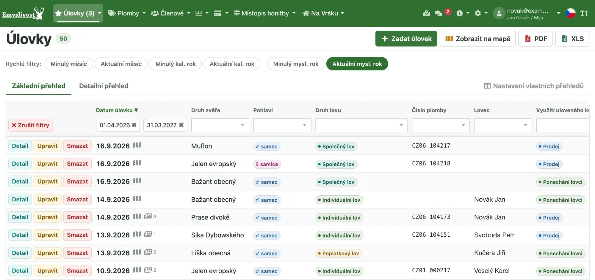 Web + mobile app
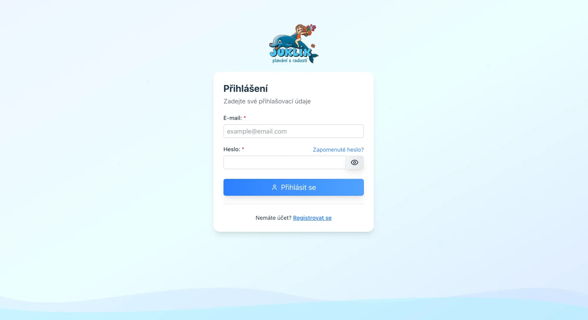 Custom web application
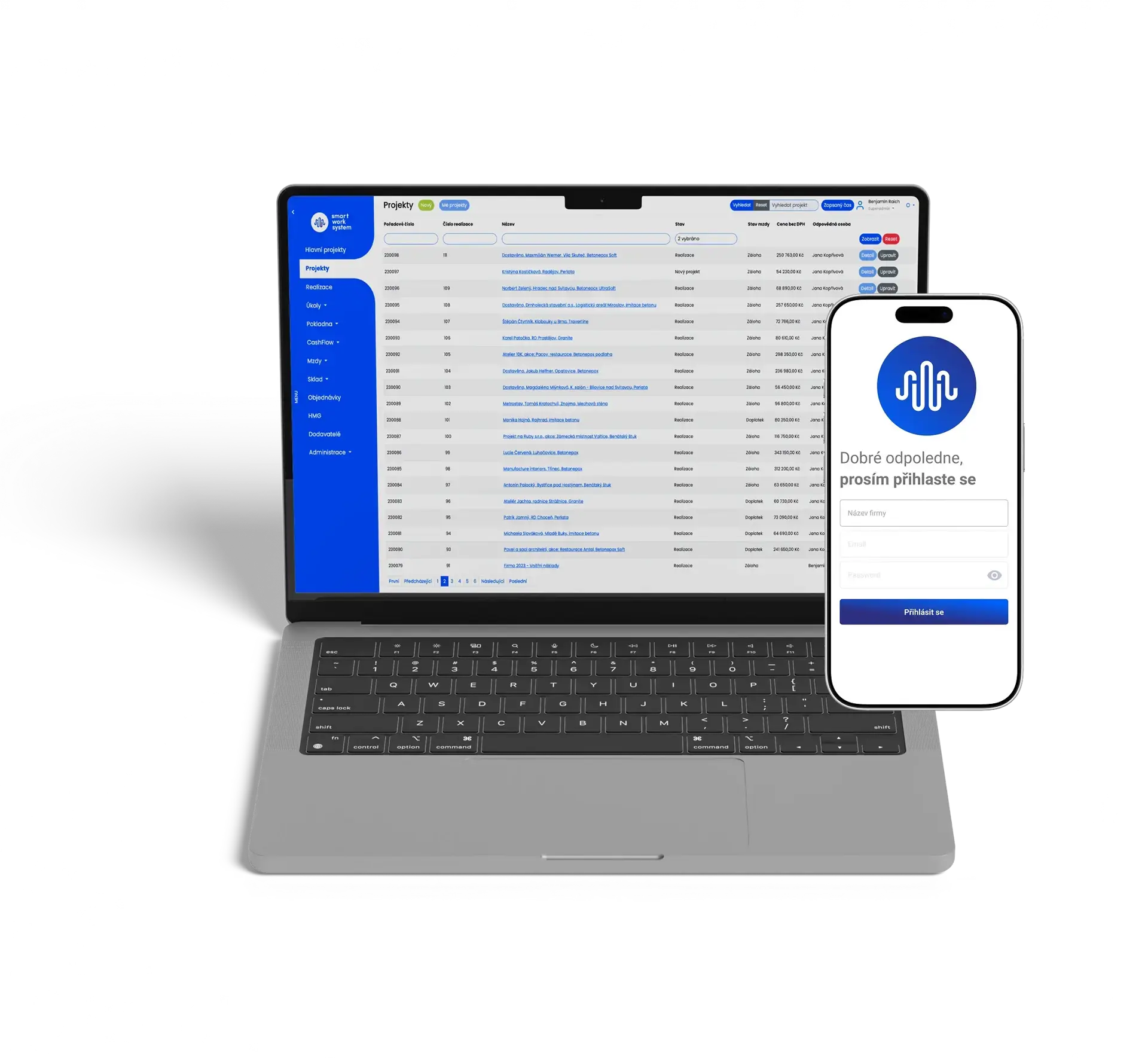 Web + mobile app
Excellent quality of service, and the way features are thought through is absolutely perfect.
You do not need to know anything on this page. Just tell us what the app should do and who will work with it – we will take care of the design and the UX. In a first consultation we will talk through your idea, or the system people struggle with.